
Creation of birds
Written by Karl Mårtens
“The element of surprise does not come from the unplanned, rapid execution as it does with the watercolour medium. So how can one find the unexpected in this detailed and elaborate process? ”


My lithographs are not “reproductions” of my paintings. Each image is created especially for a specific lithographic edition, without any original image as model. The printed result becomes an original - but as an edition. I also want to use the lithography medium as a point of departure for the image, just as I use the watercolour medium as a point of departure for my paintings.
For a lithographic print, I need to plan every colour shift before it’s printed, slowly and consciously building a harmony of all the colours - often the image has to pass through the press ten to twelve times - at times even more, before all nuances and colour transitions harmonise. It requires strict precision and a profound knowledge of how printed colours interact (here I also receive help from the printer). Needless to say, the element of surprise does not come from the unplanned, rapid execution as it does with the watercolour medium. So how can one find the unexpected in this detailed and elaborate process?
The image
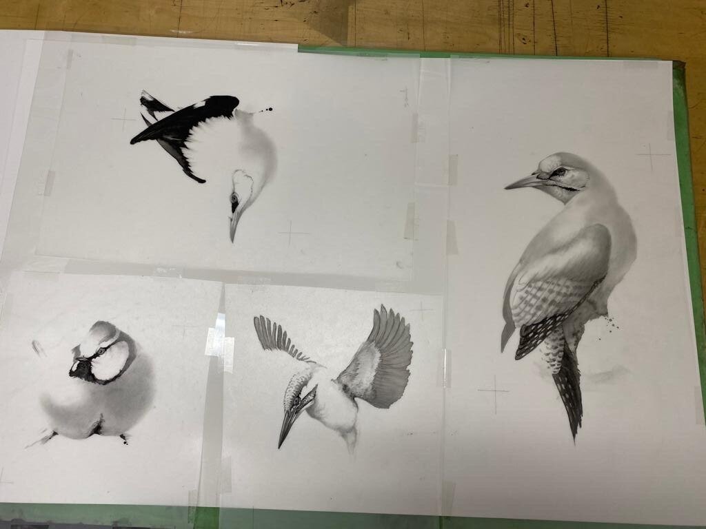
The first step of the lithography process consists of creating a base image. I do this by painting my image on the matte surface of an acetate film - only using black, regardless of the colour of the finished bird. I mostly use gouache, but crayon, pencil, ink or watercolour work as well.
The first film is thus a black and white rendering of the bird that is going to be depicted in the lithograph. I use my Asian brushes, salt, and most often lots of water, just as in my painting. I paint this first image as quickly as I paint a watercolour image. And the result is often as unexpected as in a watercolour painting, as I try to paint from “emptiness” here as well. The black gouache also dries in very unexpected ways, just as watercolour does. And as usual, the more I can let go of control the more free and more satisfactory the image becomes.
“Just like in my painting, I leave the face of the bird until the end, then having to adjust it to my “mistakes”. This gives rise to many unexpected personalities in the attitudes of the the birds. ”
After that, I have to try to decide if the image is to be dark or light, bright or neutral and in that case which colours have to be painted in order to achieve the image I have in mind. The odd thing with painting these films is that even if the colour I intend to achieve is light, for example yellow, the film has to be painted intensely black. And or very colour to be printed - in fact, every nuance of colour to be printed - a new film has ti be created which fits the shape of the bird on the initial film. Some films cover the whole bird, while others include just small details that require a different colour. I also have to “stay within the lines” of the birds contour, which demands an intellectual, focused attitude towards the image. There are few surprises, but at the same time, given that everything still is black and white, I actually have no idea what the outcome will look like.

The print
Now the whole process is moved to the print shop and the work continues in consultation with my editor who would be present during this stage. Despite having to surrender a great deal of the responsibility to the printer, all final decisions are up to me. Here I have a hard time resting in “emptiness”, however I I still have to dare to “surrender”. It can sometimes take days before the image is somewhat birdlike, since the colour steps are so small. It commands all my presence of mind to curb my impatience and fear of a bad result.
“ In this, my printer almost becomes a therapist, calmly and carefully guiding me through my doubts, evoking trust in my intuition and the process.
”
That which has been printed cannot be removed. This is a fundamental “law” of lithography. That means, for example, that if you, while printing colour number eight, discover that your choice for colour number five was no good, there is only one way to go, and that is forward. The question then arises: What do I do with what already is? In other words - how should I relate to reality? A common Zen question.
Some other fundamental “laws” govern the art of printing: Already printed light colours can be made darker however already printed dark colours cannot be made lighter. Intense and vivid colours can be muted however muted colours cannot be made intense and vivid. This is because the printing inks are transparent. In addition, we have the ever-present paradox that black can “extinguish” the colours of the imagine by making it “flat” however at the same time make the lighter colours seem more vivid and intense. Thus, it is an exercise in restraint and relativity - just like in Zen.

These “laws” control the process and because of my mistakes, the image sometimes moves in another direction than the one I had envisioned in my mind. The unexpected has then once again returned to direct the process. I then have to abandon the path towards the planned result and simply work with whatever is in front of me. Sometimes an image which was meant to be light end up being dark. At times we finish the image while it is still light, even though the plan was to make it dark.
“Just like in painting, the image tells me when it is time to stop and remarkably we almost always agree when it is ready which in some way confirms that the image has a life of its own. ”
So after all, the unexpected does have a great effect on my lithography process even if it occurs in totally different ways than in my painting. As an exercise in getting to know myself and trusting my intuition, this process is just as rewarding as with painting. And just like in painting (and most of my undertakings) I realise that I will never be “done” - that it is the journey that is the goal and the unexpected is my friend along the way.

Mina litografier är inte “reproduktioner” av mina målningar. Varje motiv är skapat speciellt för en specifik litografi-upplaga, helt utan någon förlaga. Det tryckta resultatet blir ett original - fast i upplaga. Jag vill dessutom använda litografimediet som utgångspunkt för bilden, precis som när jag använder akvarellmediet som utgångspunkt för mina målningar.
För att en litografibild måste jag planera varje liten färgskiftning innan den trycks, för att långsamt och medvetet bygga upp en harmoni mellan alla färger - ofta ska bilden gå genom tryckpressen tio till tolv gånger, ibland även mer än så, innan alla schatteringar och övergångar samspelar. Det kräver strikt precision och en djup kunskap om hur tryckfärger interagerar (här får jag också hjälp av min tryckare). Och då säger det sig självt att överraskningarna inte kommer från det oplanerade, snabba utförandet som i akvarellmediet. Så hur ska man hitta det oväntade i denna detaljerade process?

Motivet
Det första steget i litografiprocessen är att skapa ett grundmotiv. Det gör jag genom att måla mitt motiv på en “kornerad” (eller mattslipad plastfilm) - enbart i svart, oavsett vilken färg den färdiga fågeln kommer att ha. Jag använder mestadels gouache, men svart krita, penna, tusch eller akvarell fungerar också.
Den första filmen (bilden) blir alltså en svartvit målning av den fågel som ska avbildas på litografiet. Jag använder mig av mina asiatiska penslar, salt och oftast mycket vatten, precis som i måleriet. Det går lika snabbt att måla denna första bild som det gör att måla en akvarell. Och resultatet blir är ofta lika oväntat, eftersom jag även här försöker att måla från “tomheten”. Den svarta färgen torkar också på mycket oväntade sätt, precis som akvarellen. Och som vanligt - ju mer jag kan släppa kontrollen, desto friare och mer tillfredsställande blir bilden. Precis som i mitt måleri så lämnar jag fågelns “ansikte” till sist, och måste då anpassa det till mina “misstag”, vilket också ger upphov till många överraskande personligheter i fåglarnas uppsyn.
Därefter måste jag försöka bestämma om motivet ska vara mörkt eller ljust, färgrikt eller neutralt och i så fall vilka färger som måste tryckas för att åstadkomma den bild jag har i huvudet. Det märkliga med att måla dessa filmer är att även om färgen som de avser är ljus, till exempel gul, så måste filmen målas med intensiv svart färg. Och för varje färg som ska tryckas - måste en ny film skapas som passar in i fågelns form på den första filmen. Vissa filmer täcker hela fågeln, medan andra innehåller enbart små, små detaljer som ska ha en annan färg. Jag måste ju också hålla mig “innanför linjerna” av fågelns konturer, vilket kräver främst ett intellektuellt, fokuserat förhållningssätt till bilden.
“Överraskningarna är få men eftersom allting fortfarande är är svartvitt, så vet jag ju egentligen inte hur resultatet kommer att bli till slut. ”

Trycket
Nu förflyttas hela projektet till tryckeriet och arbetet fortsätter i samråd med min förläggare som vanligtvis är med. Trots att jag måste överlämna en stor del av ansvaret till tryckaren som sköter pressen, så är alla beslut till sist upp till mig. Här blir det svårt för mig att stanna i “tomheten” men jag måste ändå våga “släppta taget” Det kan nämligen ta fler dagar innan bilden börjar se något sånär fågellik ut eftersom färgstegen är så små. Det kräver all min sinnesnärvaro för att stävja min otålighet och min rädsla för att resultatet inte ska bli bra. Här blir tryckaren nästan som en terapeut som lugnt och varsamt ledsagar mig genom mina tvivel och försöker mig tillit till min intuition och till processen i sin helhet.
Det som redan är tryckt kan inte tas bort. Det är grundlag inom litografin. Det betyder till exempel, om man vid tryckning av färg nummer åtta upptäcker att färgvalet vid tryck nummer fem inte alls var bra så finns det bara en väg och det är framåt. Frågan måste då bli:
“Vad kan jag göra med det som redan är? Med andra ord - hur ska jag förhålla mig till verkligheten? En typisk zen-fråga. ”
Även vissa andra “grundlagar” gäller inom tryckkonsten: Ljusa färger som redan tryckts kan göras mörkare men mörka färger som redan tryckts kan inte göras ljusare. Intensiva och klara färger kan dämpas, men dova färger kan inte göras klara och intensiva. Det beror på att alla tryckfärger är genomskinliga. Dessutom har vi den eviga paradoxen att svart kan “släcka” bildens färger och göra en bild “platt”, men lika törna kan få de ljusare färgerna att se mer klara och intensiva ut. Alltså, en övning i återhållsamhet och relativitet - precis som i Zen.

Dessa lagar styr alla beslut i processen och på grund av mina misstag börjar bilden ibland gå i en annan riktigt än vad jag hade sett framför mig. Det oväntade har alltså åter klivit in och styrt processen.
“Då måste jag våga överge vägen mot det planerade resultatet och istället arbeta med det jag har framför mig med hjälp av min intuition. ”
Ibland blir en bild som var planerad att bli ljus slutligen mörk och ibland så avslutar vi bilden medan den fortfarande är ljus även om planen för den var att den skulle vara mörk. Precis som med måleriet så är det alltid bilden som berättar när den är färdig. Märkligt nog så är vi nästan alltid eniga om när den är klar, vilket på något sätt bekräftar bildens eget liv.
Så det oväntade tar, trots allt, stor plats i min litografiprocess, även om det tar sig helt andra uttryck än i måleriet. Som en övning i att lära känna mig själv och att lita på min intuition, så är processen minst lika givande. Precis som i måleriet (och det mesta jag ägnar mig åt) så inser jag att jag aldrig kommer att bli “färdig” - att det är vägen som är målet och att det oväntade är min vän på vägen.

The following video has been created in collaboration with Cricket Fine Art and gives an insight to Karl Martens process when working with the Watercolour medium.